Climate Change Models

Status
Not open for further replies.

Hercules56

Penultimate Amazing
Joined
Aug 4, 2013
Messages
16,240
I have some serious questions about our climate change models.

I've seen a bunch of charts suggesting that all of our major models have greatly exaggerated the affects increased GHG emissions will have only global average temperatures.

The modelling calculations were applied to thee past 100 years to see if they would correctly predict previous and existing conditions.

These are the results:

https://climatism.files.wordpress.com/2013/07/cmip5-73-models-vs-obs-20n-20s-mt-5-yr-means11.png

http://c3headlines.typepad.com/.a/6a010536b58035970c017ee88df70e970d-pi

http://c3headlines.typepad.com/.a/6a010536b58035970c017d42dfdbb4970c-400wi

I'd really appreciate someone addressing this issue.

Gracias amigos un amigas.

:)

Edited by Agatha: 
Edited for rule 5. Please do not hotlink unless the originating site specifically allows it.
 
Last edited by a moderator:
Below is a climate model chart posted by the IPCC in their article about climate change modeling.

It appears to confirm my fear, that climate change models are exaggerating the future repurcussions of GHG emissions.

https://scontent-lga3-1.xx.fbcdn.ne...=6c2efdf8b34328c811f21b563829d547&oe=59E22A7D


Edited by Agatha: 
Edited for rule 5. Please do not hotlink unless the originating site specifically allows it.
 
Last edited by a moderator:
"Similar to older models, the ballyhooed CIMP5 versions fail also"

This is not a word I would expect to see in data analysis. Any idea what its scientific meaning is in this context?
 
"Similar to older models, the ballyhooed CIMP5 versions fail also"

This is not a word I would expect to see in data analysis. Any idea what its scientific meaning is in this context?

The first models I posted appear to come from the IPCC's own posted models.
 
The IPCC model I showed has almost all climate models predicting significantly higher temperature changes than were actually obvserved.

Its 2017. By 2020 we should have a pretty good idea if these models are legit or bunk.

Not only that, but the models also show much higher temperatures in the past then were actually recorded.
 
Last edited:
You posted a graph that shows warming is well within the anticipated range. It also cuts off the last couple years of data for some reason...

Even inputting 2015 swings the numbers much closer to the middle of the graphs (green box is 2015):

https://ourchangingclimate.files.wordpress.com/2015/08/realclimate_2015_updatejune_2015.png

This link also has a good run down of the silliness of the graphs Herc is using, including a discussion in the comments with some other goofballs citing those graphs:

https://ourchangingclimate.wordpress.com/2015/08/07/warm-2015-and-model-data-comparisons/

Unsurprisingly, it's mostly switching back and forth between surface and readings from higher in the atmosphere.


Edited by Agatha: 
Edited for rule 5. Please do not hotlink unless the originating site specifically allows it.
 
Last edited by a moderator:
The climate model on this page shows true temperatures well below predictions by the climate models.

It shows temperatures at the low end of the range. Subsequent years have pulled the recordings right back towards the middle.

Strangely, history did not stop in 2012.
 
you posted a couple of graphs ending 2012.. isnt this just a "no significant warming crap?? or models are crap.. crap??

where is the same data going up to last year?

I haven't seen any charts showing lots of climate models compared to actual data, going through 2016.

If you find one, PLEASE post it.
 
at first glance, it appears that the climate models may have overestimated the amount of surface warming over this period.

Climate models, however, cannot predict the timing and intensity of La Niña and El Niño [or] timing and duration of volcanic eruptions and industrial pollution, both of which eject light-scattering aerosols into the atmosphere and therefore reduce surface warming...

When the input into the climate models is adjusted to take into consideration both the warming and cooling influences on the climate that actually occurred, the models demonstrate remarkable agreement with the observed surface warming in the last 16 years.
What's the difference between a model and reality? Everything that isn't modeled. Unless you know what is in the model and what isn't, you cannot make any judgement about how 'accurate' it is.
 
I haven't seen any charts showing lots of climate models compared to actual data, going through 2016.

If you find one, PLEASE post it.

Now, let's use our skeptical hats here. Why do you think the graphs you have, all originating from a guy named Chirsty*, end in 2012 and you can't find an update for the last 5 years?

Hmm....So difficult to come up with a reason for that.

*Link breaking down the Christy tactic: https://ourchangingclimate.wordpres...-spencer-flat-earth-hot-spot-figure-baseline/
 
We must assume that climate change predictions and GHG emission goals are based on these models.

If the models are too aggressive, goals for GHG reductions need to be reduced.

You cannot have understood what you responded to.

If you're doing this year by year, it's going to be a mistake. Mt. Pinatubo can erupt, and the warming slows or even drops for 3 years. No model can predict the next volcanic eruption.

But over time, those sorts of events are not sufficient to stop the warming trend and, in fact, we see that since 2012, warming has pulled observation right back to the center of those predicted ranges.

And that's assuming we aren't engaging in the surface temp. vs. high atmosphere.
 
Now, let's use our skeptical hats here. Why do you think the graphs you have, all originating from a guy named Chirsty*, end in 2012 and you can't find an update for the last 5 years?

Hmm....So difficult to come up with a reason for that.

*Link breaking down the Christy tactic: https://ourchangingclimate.wordpres...-spencer-flat-earth-hot-spot-figure-baseline/

The IPCC graph I posted is not from "Christy".

It shows the climate models very often overstating temperatures in the past, and overstating recent temperature changes.
 
The IPCC graph I posted is not from "Christy".

It shows the climate models very often overstating temperatures in the past, and overstating recent temperature changes.

So, you're distancing yourself from all of the others? You acknowledge that they have been sufficiently explained?

Why do you think the IPCC included those observations in their report? Do you think that the scientists produced a report that contained information sufficient to debunk their conclusions within?

I have given you multiple links that explain that in great detail. The IPCC understands that issue and still reached the conclusions they did, why do you think that it is?

I saw the IPCC graph last, but it appears one of the graphs I earlier posted is just a small portion of the IPCC graph.

Why did the IPCC post this graph, knowing that it shows recent temperatures lower than pretty much all of their climate models?

I have no damn clue.

What happens if this trend continues for years 2012-2017? Who knows.

But if the models continue to veer way higher than the actual temps through 2017-2020, I'd like to know how we can base GHG emission goals on models that are clearly flawed.
 
I saw the IPCC graph last, but it appears one of the graphs I earlier posted is just a small portion of the IPCC graph.

Why did the IPCC post this graph, knowing that it shows recent temperatures lower than pretty much all of their climate models?

I have no damn clue.

Because taking a year, 5 years, or even a decade doesn't tell you anything important when we're talking about climate trends.

Over the long trend, the models have been shown to be very accurate, especially since there's been a regression to the mean in the last 5 years.

What happens if this trend continues for years 2012-2017? Who knows.

It hasn't, so there's not much use in wondering about that.

But if the models continue to veer way higher than the actual temps through 2017-2020, I'd like to know how we can base GHG emission goals on models that are clearly flawed.

3 years won't tell you a damn thing.
 
We must assume that climate change predictions and GHG emission goals are based on these models.

If the models are too aggressive, goals for GHG reductions need to be reduced.
Evidence?

The truth is, we are doing almost nothing to reduce GHG emissions. The so called 'reductions' are not reductions at all - they are merely a slight decrease in the constantly increasing amount of greenhouse gas we are putting in the atmosphere. And even if we stopped all GHG emissions so that we weren't adding any more, it would still take hundreds of years to get back to where we were. To actually decrease greenhouse gasses and reverse global warming in a reasonable time frame we would have to start removing the stuff we put up there.

Climate Action Tracker: USA
Current US policies, including the Clean Power Plan, would only reduce emissions to 10% below 2005 levels by 2025.[2] If the Clean Power Plan is stopped, emissions in 2025 are likely to be even higher, at 7% below 2005 levels, halting the downward trend of the last decade...

The “medium” rating indicates that the US’s climate plans are at the least ambitious end of what would be a fair contribution. This means it is not consistent with limiting warming to below 2°C, let alone with the Paris Agreement’s stronger 1.5°C limit
 

Attachments

  • climate action usa.jpg
    climate action usa.jpg
    71.5 KB · Views: 7
This article goes into some depth about the ways in which dishonest graphs have been used and why they're incorrect:

http://www.realclimate.org/index.php/archives/2016/05/comparing-models-to-the-satellite-datasets/

Also, more discussion of models, what they tell us, what they mean, how deniers try to manipulate them:

http://www.realclimate.org/index.php/archives/2013/09/on-mismatches-between-models-and-observations/

This ^

But you can't tell that to people who bought the million dollar Madison Av Exxon narrative.
 
Now, let's use our skeptical hats here. Why do you think the graphs you have, all originating from a guy named Chirsty*, end in 2012 and you can't find an update for the last 5 years?

Hmm....So difficult to come up with a reason for that.

*Link breaking down the Christy tactic: https://ourchangingclimate.wordpres...-spencer-flat-earth-hot-spot-figure-baseline/

I knew all these debunking resources existed. What I don't understand is why there are still hangers-on to the denial. Even the CEO at Exxon, the corporation most responsible for selling the denial, recognizes they were selling a big lie.

Climate Change Deniers: Even Exxon’s CEO Has Abandoned You.

Of course that's because he now has a work-around to still keep the oil flowing.

Rex Tillerson Refuses To Admit Exxon Knew About Climate Change Decades Ago
But the oil giant’s former CEO, now President-elect Donald Trump’s pick for secretary of state, said he believes in global warming....

For years, Exxon Mobil funded a Big Tobacco-style disinformation campaign aimed at undermining public understanding of the science behind global warming. Documents published in 2015 by InsideClimate News and the Los Angeles Times revealed that the company understood climate change decades ago and deliberately covered up the evidence to protect its financial interests.
 
Even if we take the graphs of the OP as fact and at face value, it still shows increasing temperatures. So, the most a "denier" can state with this is that global warming is happening a little bit slower than those evil scientists say it is. It still shows a need for the global community to take action.
 
the company understood climate change decades ago and deliberately covered up the evidence to protect its financial interests.

yup - that's where the liability arises that they are desperately trying to mitigate. They were told clearly by their own scientists in the 70s ( as revealed in court docs ) that the burning of fossil fuels would warm the planet.

To compound the liability aspect ...they embarked on an expensive "muddy the waters" campaign by funding climate change deniers. Only a shareholders revolt led by the Rockfeller family with their large share holdings finally got that disinformation funding stopped.

This is well worth taking the time to watch
http://www.pbs.org/wgbh/frontline/film/climate-of-doubt/

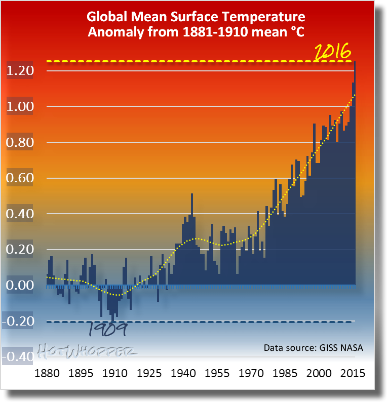
Paris is looking for 1.5C limit above pre industrial by 2100 ....

This is where we are

annualgistemp16.png


Without active CO2 removal we will blow past that by the mid 2020s

Now 2016 was an El Nino year as was 1998 .....unfortunately 2017 is to be another El Nino year ....the heat goes on.
The Arctic temps and the global temps in El Nino years are simply forewarnings ....
 
Last edited:
Finally a link!

Take a look at these ocean heat charts from the report. Note the black line (observed) slap bang in the middle of the modeled data. Seems at least some major models are pretty accurate, no?

The other chart is right below the one you posted. Surprise! The models are a good match to the observed data!

And even your example doesn't show what you say it does. Yes, the average is slightly higher than observations for a few few years at the far right end of the chart, but before that they are very close - and without knowing the expected variance you can't say that the 'anomaly' is significant (it certainly is inside the range of projections).

Looks like someone has been cherry picking...
 

Attachments

  • hercules fail.jpg
    hercules fail.jpg
    97.2 KB · Views: 2
  • hercfail2.jpg
    hercfail2.jpg
    64.1 KB · Views: 2
It still shows a need for the global community to take action.
Sure, but how much action? The assertion is that we are doing more than necessary. But since we are doing almost nothing now, any less might as well be zero...

But what's worse, part of the reason for observations being lower than some models is the 2009 economic downturn. Now that the brakes are off and we are Making America Great Again, expect to see significantly increased GHG emissions. Business as usual!

My point is that as long as the trend is upward, we haven't taken enough action. You are correct, we've taken virtually no action. But really, even this attempted argument against taking action is not very good at all. I guess it is hard to come up with a good argument since the facts are not on the denialist side.
 
And yet you still haven't read the paragraphs on either end of the chart you posted. Look at the report. Read the section that describes the chart you posted and the section below it that specifically explains why the models are accurate despite the slight disagreement over the last decade.

You can't really get mad when people accuse you of trolling when the answers to your questions are literally on the same page of the report you pulled the charts from.

Let's see how the modeling programs compare to actual observed data, in 2020.

I am not doubting that the Earth is getting warmer.

I am questioning how much warmer it is getting at what rate.

If the Earth continues to warm at a rate lower than most models predict and lower than the mean of most models, we can adjust our international demands on GHG emission reductions accordingly.

Or do you prefer we base our assumptions and plans on the most scary scenarios?
 
If the Earth continues to warm at a rate lower than most models predict and lower than the mean of most models, we can adjust our international demands on GHG emission reductions accordingly.

Or do you prefer we base our assumptions and plans on the most scary scenarios?

Seriously, did you read any of the links I posted that show that observed temperature has pulled back right into the middle of the aggregate model predictions over the last 3-5 years?

Why do you keep saying this on multiple threads when it has been shown to be incorrect?
 
Let's see how the modeling programs compare to actual observed data, in 2020.
Why wait? In 2017 observations lie in the middle of projections. That's why you're having to rely on 2012 data, the last La Nina in the cool phase of the PDO. We're in a warm phase now and will be for quite some time.
 
Or do you prefer we base our assumptions and plans on the most scary scenarios?

classic climate denier cop out.....-

Sensible people ...plan for the worst...hope for the best ......you don't even mention sealevel which has enormous consequences in even shorter terms than the global temps

New study finds the oceans are rising three times faster than they were ...
https://www.washingtonpost.com/.../2017/.../scientists-say-the-rate-of-sea-level-rise-has-...
May 22, 2017 - washingtonpost.com · 1996-2017 The Washington Post · Terms of Service · Privacy Policy ... Scientists say the pace of sea level rise has nearly tripled since 1990 ... “The sea level rise is now three times as fast as before 1990,” Dangendorf said. ... An acceleration of sea level rise, after all, is an expected ...
there are trillions of dollars of infrastructure at risk and the US east coast is rising faster both in sea level and temperature

Northeast warming more rapidly than most of US - The Boston Globe
https://www.bostonglobe.com/metro/2017/01/12/northeast-will...faster.../story.html
Jan 13, 2017 - By David Abel Globe Staff January 13, 2017 ... Temperatures in the Northeast have already risen faster than global averages. ... will have a disproportionate impact on cities along the East Coast. The Northeast could see sea levels rise about 25 percent higher than other parts of the planet — perhaps by as .

and since global averages are not indicative regionally ....you have to look at the Arctic which is warming 4 x faster and offers a glimpse to the future..

Regardless of your nonsense ....the world is moving to carbon neutral both because it is necessary to mitigate climage change and it makes economic sense..

It sounds very much like you are looking for an excuse to slow the move the carbon neutral and that is simply brain dead......
your time better spent on actually learning some climate science and the current state of the planet instead trolling denier blogs....
 
Let's see how the modeling programs compare to actual observed data, in 2020.
This is a poorly reasoned position. It is equivalent to waiting to see how long your car will run before it needs a major repair without preventive maintenance in the mean time. I'm sure you'll recognize this now.
 
Each successive year for the past several has been the hottest on record. Sea levels are rising at an alarming rate. It behooves us all to treat these signs as indicators of a continuing trend, just to be on the safe side. In the same way that geopolitical issues can be slanted by choice of map projection, so too can climate change deniers warp perception by slyly selectve presentation of data.

Only a fool does not prepare for the worst--to the extent possible--when the stakes are so incredibly high. I worry about the release of methane, a 20-fold more potent greenhouse gas that CO2, when vast tracts of tundra have their permafrost melt. It won't take much of a temperature increase to get that scary ball rolling.
 
Or do you prefer we base our assumptions and plans on the most scary scenarios?
Who is doing that? Certainly not the IPCC or the UN.

Want to know what the most scary scenario is?

Climate Change's Worst-Case Scenario: 200 Feet of Sea Level Rise
Winkelmann and colleagues found that seas could rise nearly 10 feet each century in the first 1,000 years under this scenario, and would continue to rise for thousands of years after that. Some scientists reviewing the study, though, said researchers may have even underestimated the speed of ice melt and sea level rise.
And that doesn't even touch on the damage above sea level.

The scenarios we are basing our plans on are actually quite conservative. If you think those scenarios are scary then prepare to be afraid - very afraid!
 
I have closed this thread, as we have a dedicated climate change & global warming thread which you can find here.
Replying to this modbox in thread will be off topic  Posted By: Agatha
 
Status
Not open for further replies.

Back
Top Bottom