This from the guy who's best analysis of the images was "Flying stuff? What flying stuff?". Please. You haven't a lick of scientific credibility to your name after that ridiculous comment.
I have offered my analysis of various running difference images and videos many times on this forum and others starting more than 4 years ago. None of them amounted to "Flying stuff? What flying stuff?" Your comment is a lie. Still. Again.
Except for the fact I've created them including those STEREO images on my website. Have you even bothered to make one yourself? Yes or no?
Yes. Take two images, add 50% gray to the first one, then subtract the value of each pixel in the second image from the value of the corresponding pixel in the first image. The running difference output of that mathematical process is a graph where each pixel is a simple graphical representation of the calculated difference between the pixels in the first image and their counterparts in the second. For a video you use sequential frames, or frames a given distance apart, and make the mathematical comparison the same way. A running difference video is simply the series of processed output frames.
Once more, in case we have lurkers or newbies here: A running difference image is not a picture of anything real or tangible or solid
per se. It is a graph, a chart, a visual representation of a series of mathematical calculations. The running difference images Michael tries to foist upon us as evidence of a solid surfaced Sun are no more pictures of the Sun's surface than a pie chart is an actual picture of blueberry pie or a bar graph shows a row of buildings.
One of the interesting things about a running difference image (BTW, they call them that for a reason) is the fact that any static features, anything solid or stationary, anything that
doesn't change between the input images will show up as neutral gray in the running difference output. You won't see it.
If you have a series of weather images of clouds passing over Mt. Everest, and you create a running difference graph from those images, the output will show the change in location (maybe temperature, maybe moisture content, maybe density, depending on what the original images showed of course) of those clouds.
But Mt. Everest, by nature of the fact that it didn't change from image to image in the originals, won't even show in the running difference output. That's how surface features are handled in the running difference processing.
So let's see if you did this correctly, you know, the way they do it at LMSAL to create the running difference graphs you imagine show a solid surface on the Sun...
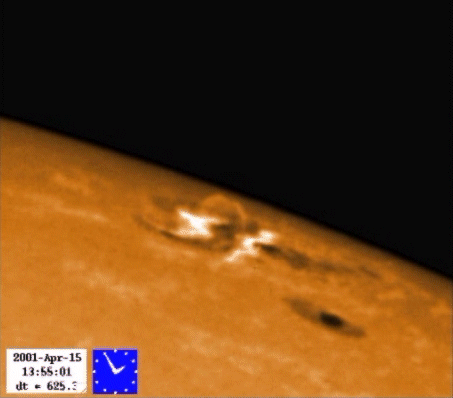
Which images did you use as your input for the PM-A.gif image? What mathematical process did you apply to obtain your result? In that image, the pixel in column 1371, row 758 has a value of about 20% black. Why is it that color? (Prediction: I don't think you have the qualifications you claim and you can't answer this question because you don't understand running difference images. I predict a tantrum instead because blowing
your problems off onto other people is one of your dishonest tactics to distract from the legitimate questions you can't answer.)
Where in that image do you believe you're seeing solid physical features? Why does no professional physicist on Earth agree that's what you're seeing? And perhaps most importantly, what is it about the creation process that makes you think you see physical features below the photosphere when the data gathered to create the original images was taken from thousands of kilometers above the photosphere?
Let's repeat that question right here, since you will likely ignore it. No excuses this time, Michael. None of your standard ploy of ignoring the questions that make you uncomfortable. This is apparently a very difficult thing for you to deal with because you've ignored it flat out for years. You claim that you're seeing solid surface features in running difference images.
In your image PM-A.gif, or any running difference image or video for that matter, what is it about the process of creating a simple graphical representation of a series of mathematical calculations that you believe allows you to see physical features below the photosphere
when the data used to create the original images was taken from thousands of kilometers above the photosphere?
You see, you've been touting that very first image on your web site as being a sort of smoking gun for years now. If you can't explain (not assert but explain, support with evidence, describe in a plausible
quantitative legitimately scientific way) how it actually shows what you claim it shows, then of course you'll agree that you should remove it from your web site and stop trying to use it to support your crackpot conjecture.
Which pixel(s) in which images would you like me to use? Or which video?


") )
)


")